Motto: Social Dating App
Motto is a new app designed for queer men, transgender, and non-binary people to connect, meet, and have fun in an effective and respectful way.

Overview
Joel Shimkai, founder and former CEO of Grindr—the world's leading social networking app for queer connections—set out to design an elevated, inclusive hookup app for the queer community.
The goal was to cultivate satisfying experiences and connections with less frustration while improving upon the shortcomings of his previous venture.
My Role
Lead Product Designer
Problem Statement
Existing dating/hookup apps for the queer community aren’t effectively satisfy their users needs. It takes too much time and effort to get expected results while also exposing their users to a toxic culture.

Pain points
-
Users struggle to find what they need, when they need it, and their preferences change often.
-
Too much time and effort wasted on unenjoyable experiences.
-
Lack of high-quality information to make informed decisions.
-
Excessive fake or spam users.
-
A toxic culture that discourages engagement.
We defined three personas across a spectrum, from those seeking casual fun to those looking for meaningful romantic connections.

Navigation
After multiple rounds of workshops and ideation sessions, we shaped the product vision and strategy to align with business goals and market opportunities. As a result, we defined the app’s navigation into five main sections, ensuring a seamless and intuitive user experience.

Grid exploration
We explored different options, considering both our users' needs and how to stand out from competitors. Unlike other hookup apps—where photos are often optional, and some profiles may not display any at all—our app ensures a more visual and engaging experience. Instead of limiting profiles to a single image, we showcase multiple photos per user. We experimented with different layouts, including a grid with one photo per user versus leveraging our unique approach to display multiple images per row, giving users a more comprehensive view of potential matches at a glance.


Final Explore Section Included
-
3 or more face photos
-
Displays intentions and status
-
De-prioritized name display
-
View toggle button
-
Preset views
-
Full profile views while scrolling
-
Easy access to: Hide, mini bio, profile, message

Grid Interactions
Users can seamlessly navigate the app by swiping left or right from the main explore grid to remove profiles, view more details, or start a chat. This intuitive design offers quick access and an efficient experience for those who prefer to skip full profiles and get straight to the point.

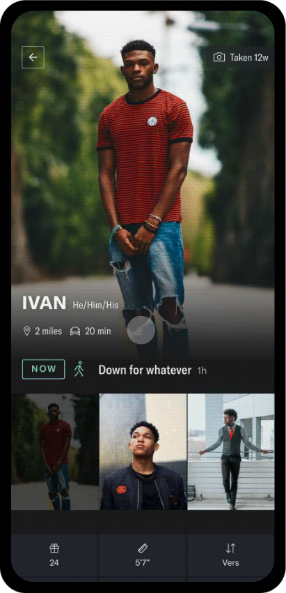
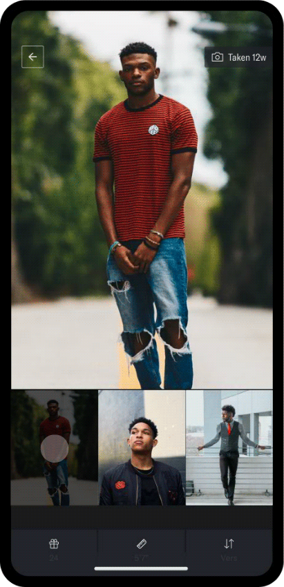
Profile View
“Not enough/quality information to make a decision”
Profile view included: photo gallery, distance and ETA, status and intentions, most relevance stats, bio, searchable tags and instagram
Botom Toolbar
Our easy-access bottom toolbar allows users to effortlessly switch between their profile and chats with a simple swipe left or right, ensuring a smooth and intuitive navigation experience.

Setting intentions
Users have trouble finding what they what, when they want it. And what they want changes often
-
Mood will disappear after 24hs.
-
Can be updated any time.
-
Will be displayed on grid and profile.

Chats and Shareable Photo Albums
“Too much time and effort spent in things users don’t enjoy”
Users can organize chats and easily create and share photo albums with their best pictures.

Real Members and Safety
“Too much fake/spam users”
-
Every profile has at least 3 face photos
-
All profiles are verified
-
No screenshots allowed in the app

Onboarding Flow and Waitlist
To build critical mass for our launch, we implemented a waitlist strategy seamlessly integrated into the onboarding flow. This approach helped generate excitement, foster community engagement, and ensure a strong user base from day one.


Design System
After defining the logo and the app's look and feel, the team focused on creating a cohesive design system. We collaborated closely with the engineering team to ensure a seamless development process and a consistent user experience.

Website
We designed and launched a marketing website featuring app download links, key information, and a dedicated FAQ section to support and engage users.

Final Accomplishments
-
Successfully launched the app’s waitlist in March 2022 in Miami, Florida, building a critical mass of 5,000+ pre-registered users within two months.
-
Designed and launched the MVP by June 2022, enabling early adopters to test and validate core features.
-
Achieved high engagement rates and positive early feedback, with users reporting a more seamless and satisfying connection experience compared to existing platforms.